In an era where the digital pulse beats strongest on our smartphones‚ the mobile web is no longer an afterthought—it is the primary battlefield for user engagement and business success․ As billions navigate the internet predominantly through their handheld devices‚ the seamless‚ high-performing mobile experience has transitioned from a desirable feature to an absolute imperative․ Yet‚ for many‚ the intricate art of truly understanding and optimizing a website’s performance on these diverse mobile platforms remains a formidable‚ often bewildering‚ challenge․ This isn’t merely about shrinking a desktop layout; it’s about crafting an intuitive‚ lightning-fast journey tailored for touchscreens and varying network conditions․
The modern web demands precision‚ and inspecting a website on mobile devices is the remarkably effective compass guiding developers and designers toward perfection․ From identifying elusive layout glitches to diagnosing performance bottlenecks that deter even the most patient users‚ the ability to dive deep into the mobile browser’s underlying structure is incredibly powerful․ This comprehensive guide will demystify the essential techniques‚ providing the insights needed to transform your approach to mobile web development‚ ensuring your digital presence not only survives but thrives in the palm of every user’s hand․
| Method | Description | Key Tools/Platforms | Best For |
|---|---|---|---|
| Desktop Browser DevTools (Emulation) | Simulates various mobile devices directly within your desktop browser‚ offering a quick and accessible way to test responsive design and basic interactions․ | Google Chrome DevTools‚ Mozilla Firefox Responsive Design Mode‚ Microsoft Edge DevTools | Rapid prototyping‚ responsive layout testing‚ preliminary CSS/JS debugging without a physical device․ |
| Remote Debugging | Connects your desktop browser’s developer tools to a physical mobile device‚ allowing real-time inspection and debugging directly on the actual hardware․ | Android Debug Bridge (ADB) with Chrome DevTools‚ Safari Web Inspector (for iOS devices)‚ Flipper | Accurate performance testing‚ device-specific bug identification‚ JavaScript debugging on real devices‚ network analysis․ |
| Cloud-Based Testing Platforms | Provides access to a vast array of virtual and real mobile devices in the cloud‚ enabling comprehensive testing across diverse operating systems and browsers․ | BrowserStack‚ LambdaTest‚ Sauce Labs‚ CrossBrowserTesting | Extensive cross-browser/cross-device compatibility testing‚ automated testing‚ scaling test efforts‚ simulating various network conditions․ |
| On-Device Developer Tools (Limited) | Some mobile browsers offer rudimentary developer tools directly on the device‚ primarily for quick CSS adjustments or console logging; | Firefox for Android Developer Tools‚ Termux (for command-line access on Android) | Quick‚ ad-hoc inspections‚ minor styling tweaks‚ basic console log review on the go․ |
The Ubiquitous Power of Desktop DevTools: Your First Line of Defense
For many developers‚ the journey into mobile web inspection begins not on a mobile device itself‚ but paradoxically‚ on their trusted desktop browsers․ Tools like Chrome DevTools‚ Firefox Responsive Design Mode‚ and Edge DevTools have evolved into incredibly sophisticated environments‚ offering robust emulation capabilities that simulate a wide array of mobile devices․ By integrating insights from these powerful platforms‚ one can instantly switch between different screen resolutions‚ pixel densities‚ and even user agents‚ gaining an immediate visual understanding of how content reflows and adapts․ This method‚ while not a complete substitute for real-device testing‚ is remarkably effective for initial responsive design adjustments‚ debugging CSS issues‚ and verifying basic JavaScript functionality․ It’s akin to a skilled architect utilizing a detailed blueprint before stepping onto the construction site‚ allowing for proactive adjustments that save considerable time and resources down the line․
Leading web performance experts consistently underscore the importance of leveraging these desktop emulation tools as a foundational step; “Before even touching a physical device‚ a developer should be thoroughly utilizing their browser’s built-in responsive design modes‚” advises Sarah Chen‚ a distinguished UX engineer at a prominent e-commerce giant․ “It’s about catching the low-hanging fruit—the obvious layout breaks or font scaling issues—before diving into the more complex‚ device-specific nuances․” This approach empowers developers to iterate rapidly‚ making real-time adjustments to code and instantly observing the impact across various simulated mobile environments‚ thereby streamlining the initial development cycle dramatically․
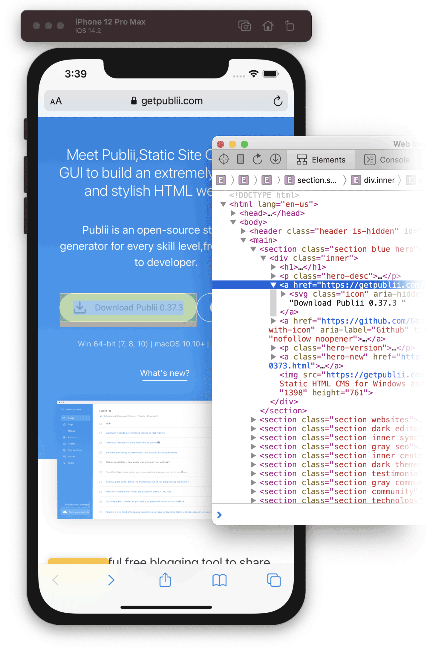
Remote Debugging: Bridging the Gap to Real-World Performance
While emulation is undeniably convenient‚ true mobile web optimization demands interaction with actual hardware․ This is where remote debugging steps in‚ offering a profound connection between your desktop development environment and a physical mobile device․ For Android‚ the Android Debug Bridge (ADB) combined with Chrome DevTools provides an incredibly comprehensive suite of tools․ Developers can inspect elements‚ monitor network requests‚ profile performance‚ and debug JavaScript directly on their Android phone or tablet‚ mirroring the rich experience of desktop debugging․ Similarly‚ Apple’s Safari Web Inspector‚ when connected to an iOS device via a Mac‚ unlocks a comparable level of granular control‚ allowing developers to meticulously examine web content rendered on iPhones and iPads․
This capability is profoundly impactful‚ moving beyond mere visual simulation to reveal the authentic performance characteristics of a website under real-world conditions․ Factors such as touch responsiveness‚ actual network latency‚ and device-specific rendering quirks—which are often impossible to replicate perfectly through emulation—become transparent․ “Remote debugging is the indispensable bridge‚” states Dr․ Alistair Finch‚ a renowned authority on mobile web architecture․ “It allows us to move past theoretical performance metrics and truly understand how a user experiences our application‚ identifying critical bottlenecks that only manifest on specific hardware or operating systems․ Having debugged countless applications‚ I can confidently say it’s where genuine optimization happens․” This hands-on approach is crucial for delivering a truly polished and high-performing mobile experience‚ ensuring that every tap and swipe feels intuitive and immediate․
Cloud-Based Platforms: Scaling Your Testing to Unprecedented Heights
For enterprises and teams needing to ensure impeccable cross-device compatibility across an ever-fragmenting mobile ecosystem‚ cloud-based testing platforms represent the apex of mobile web inspection․ Services like BrowserStack‚ LambdaTest‚ and Sauce Labs offer access to thousands of real and virtual devices‚ spanning various operating systems‚ browser versions‚ and geographical locations․ These platforms empower teams to execute comprehensive test suites‚ automate repetitive checks‚ and even conduct live interactive debugging sessions on remote devices‚ all from the comfort of their desktop․
The scalability and breadth offered by these platforms are transformative‚ dramatically reducing the overhead associated with maintaining an in-house device lab․ Imagine testing your critical e-commerce checkout flow on an obscure Android device running an older OS version‚ or verifying responsive layouts on the latest iOS beta‚ all without purchasing a single piece of hardware․ This capability is not merely convenient; it’s a strategic advantage‚ enabling businesses to reach wider audiences with confidence‚ knowing their digital product performs flawlessly across virtually every conceivable mobile scenario․ By integrating insights from these expansive testing environments‚ companies are revolutionizing their quality assurance processes‚ delivering an unparalleled level of reliability and user satisfaction․
The Future is Mobile-First: Embrace the Inspection Revolution
The journey to perfecting the mobile web experience is continuous‚ but the tools and methodologies available today are more powerful and accessible than ever before․ From the immediate feedback offered by desktop browser emulation to the deep diagnostic capabilities of remote debugging‚ and the expansive reach of cloud-based testing platforms‚ developers and designers are equipped with an unprecedented arsenal․ The ability to inspect a website on mobile isn’t just a technical skill; it’s a strategic imperative‚ driving better user experiences‚ higher engagement‚ and ultimately‚ greater success in the digital realm․
As the world continues its inexorable shift towards mobile-first consumption‚ mastering these inspection techniques is no longer optional․ It is the bedrock upon which future digital innovation will be built․ Embrace this revolution‚ empower your development process‚ and unlock the full potential of your website‚ ensuring it shines brilliantly in the hands of every user‚ everywhere․ The future of the web is mobile‚ and with these insights‚ you are now perfectly positioned to shape it․